
Via Velox is an interdisciplinary research project developed by computer science and design students. The system allows to interactively analyze bicycle traffic by visualizing rides tracked and shared by cyclists through a mobile app. The visualizations make movement data accessible and comprehensible – and contribute to a sustainable urban mobility planning.
The visualization system
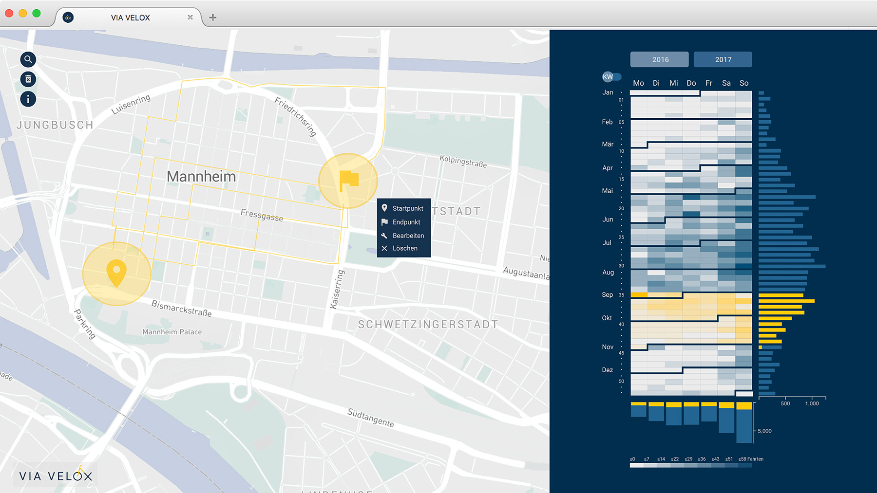
The interactive prototype provides two coordinated views: A map with bike trajectories, and a frequency matrix with a calendar heatmap and histograms (Fig. 1).
Interactive filters
Users can select areas within the map to filter bike trips which started or ended in that region. Such spatial filtering is mirrored in the frequency matrix, with all matching trips being displayed over time.

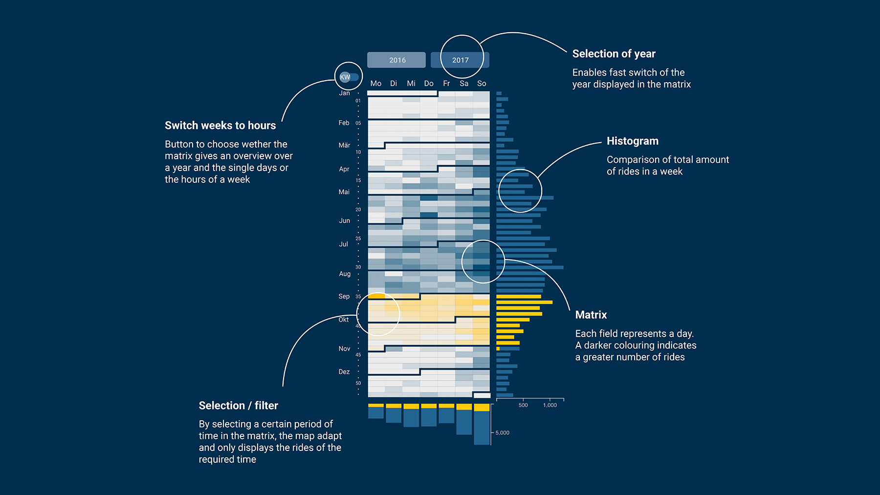
Users can select time spans via the matrix. For instance, they can select all workdays, or choose specific times of day. Two histograms on the sides show aggregated frequency of trips for each weekday, and for each week. Highlighted histogram bars enable comparing the frequency of trips in a selected time with the overall distribution of all bike trips.
Selected Insights
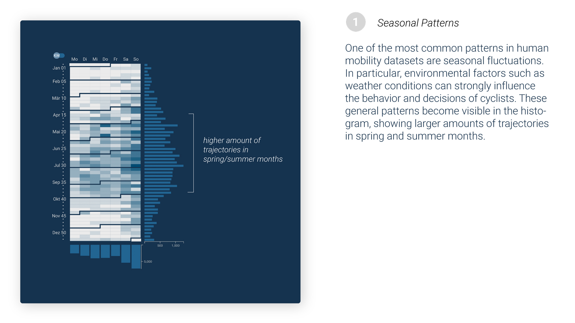
One of the main goals of our spatio-temporal visualization was to enable people to explore cycling behavior according to their personal interests. By using the different filtering mechanisms users can identify specific patterns, such as commuter or recreational cycling.


Project goals & process
The GeoNet.MRN society wanted to investigate new methods to devise and improve cycling routes based on actual need. For this, trajectory data from individual cyclists should be recorded and utilized. Within the scope of the SAP Next-Gen project “demand-oriented planning of cycling highways”, our group from the University of Applied Science Mannheim aimed to provide a visualization tool to assist exploring and understanding cycling behavior.
As a first step, we were researching related work, and analyzed various existing mobility visualizations. Second, we had a design thinking workshop with SAP in Walldorf to gather ideas, and decide which areas we wanted to focus on. We identified our challenge, and created personas together. For our visualization system we opted for two main target audiences: Cyclists, and people interested in cycling, with both wanting to explore cycling trends in personally relevant places in their environment. Exemplary are the following profiles:
- A student wants to see at what time people cycle to university and when they leave campus again.
- A SAP employee is interested in the train stations that her colleagues ride to on their commute.
- A recreational athlete wants to investigate which routes are used most frequently on weekends.
Design considerations
Next, we had to decide on the main tasks our system should support. Which data to visualize? Which interactions to offer? This was guided by the results from our extensive research on related visualizations.
The next step was to transfer our results on our defined tasks and develop our own elements. The selection of the appropriated visualization methods were made in our team. Based on these decisions and the intended functions and interactions, we created our first drafts.
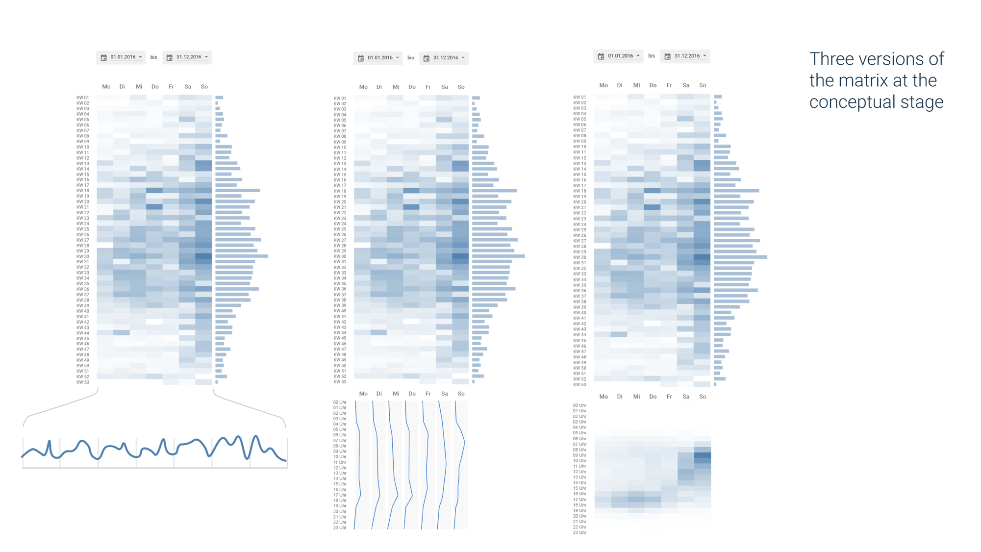


In an iterative process, we designed the layout and its elements of our web application. At the beginning, we mainly focused on the overall concept, and developed a set of use cases and possible solutions. Twice a week, the team including programmers, designs, and the supervisor met as a whole to discuss the development. With every decision, the collaboration between design and computer science students, as well as the sophistication of the system increased.
We explored early data sets with rapid visualization experiments, while designing wireframes and mockups in parallel. Over the whole process, the identified audience and their tasks informed each draft and decision.
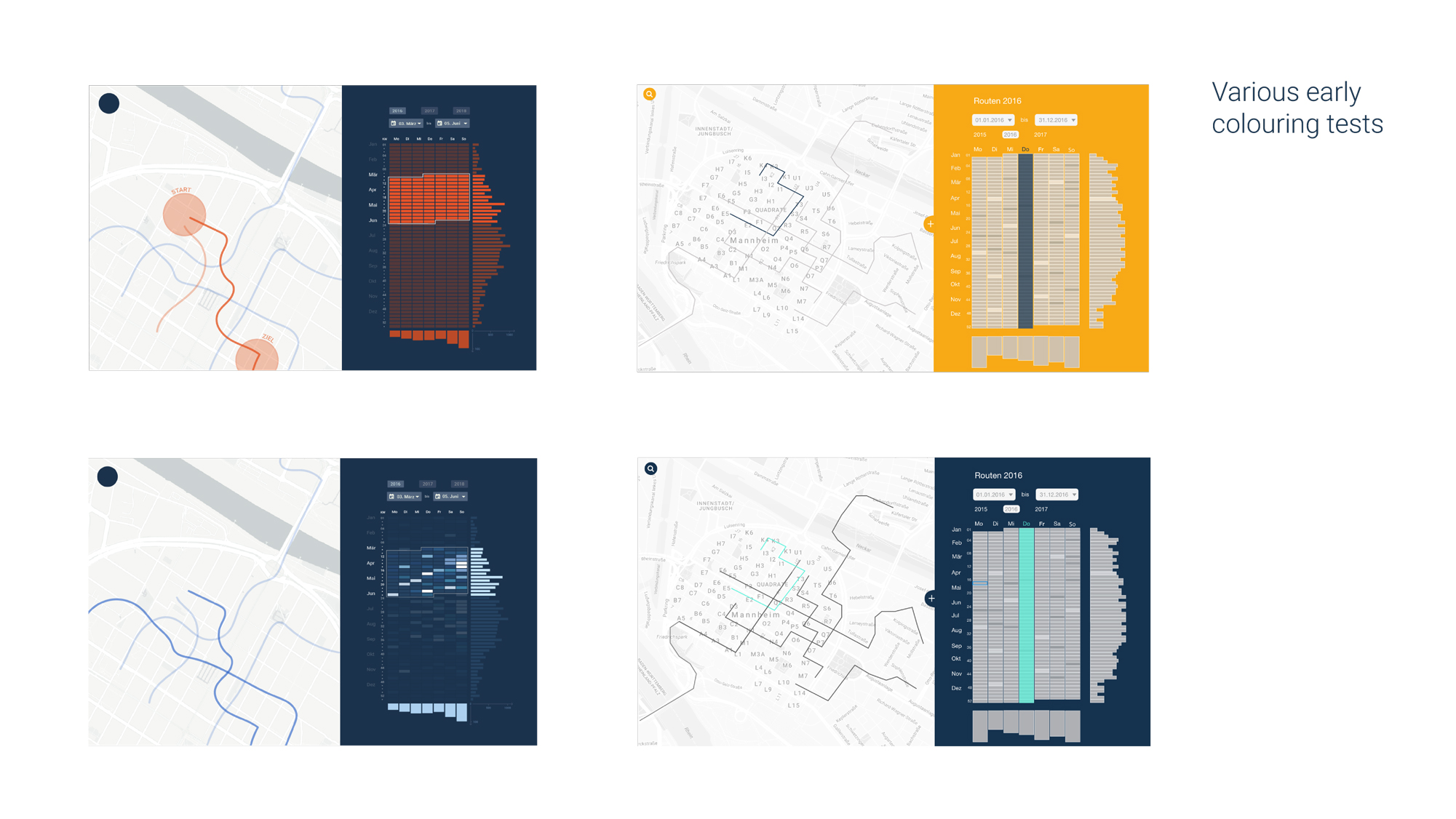

In the final weeks, we decided on a color scheme, the typography, and exact layout details. Various drafts of logos were created, and decided on the final version with input from the whole team.
Implementation
The architecture of the system is divided into front- and backend. The backend handles data filtering and aggregation, while the frontend provides the user interface and visualization. The frontend calls the backend via a simple REST interface. We created two Git repositories in order to develop both, simultaneously. The backend had a living document which was updated if a new endpoint was available for the frontend.
Data
One of the core goals of this project is to collect real bike routes from cyclists in their day-to-day activities. For this, students from our partner University of Mannheim developed a mobile app with GPS tracking capabilities. (Link to their MRN Ride app follows soon.)
As we were developing the visualization system in parallel to the app, we currently only have a couple of dozens test users. For the prototype to be scalable and provide meaningful insights, we used a larger dataset provided by GPSies. We selected bike trips from the Rhein-Neckar region, and filtered the trip data to only use tracks with valid timestamps.
Data pre-processing
In order to guarantee high responsiveness in the frontend, we needed to achieve fast database operations. Besides optimizations on a database level, we reduced trajectory data three-fold: through pre-filtering, simplification, and encoding.
The provided tracks contain GPS points every 1 to 5 seconds. By using the Ramer–Douglas–Peucker algorithm, the number of points could be reduced by 93% and still keep an accuracy of over 98% 1. In a further attempt to speed up data transfer between front- and backend encoded polylines were used instead of LineStrings 2. Combining simplification and encoded polylines reduced the size of the transferred files by 98.4%.
Backend
We used NodeJS in conjunction with the restify npm package. NodeJS is a lightweight web server which can be programmed in Javascript.
The cycling data from the tracking app is stored in a SAP HANA instance. As we are for now using data from an external source, the prototype queries trajectories from a PostgreSQL database. For the geo-spatial functions we use the PostGIS extension 3.
We designed database queries for the spatial, temporal and combined spatio-temporal filters. These can be called by REST endpoints, which returns the optimized results to the frontend.
Frontend
We implemented an API caller service which sends requests and caches responses to minimize network traffic. This was important as the number of requests rises disproportionately with the amount of start and end areas selected. To keep the map and the matrix coordinated, a synchronization service sends requests to update the interface in both views when one was changed.
We used a variety of frameworks and libraries. For the construction of the web app, we chose AngularJS in order to rapidly create our complex frontend structures. For our interactive map we used Leaflet, which makes it easy to offer geographic functionality. We utilized plugins to develop the extensions to the map view: the Leaflet-Draw plugin allowed us to provide polygon manipulations to enable setting start and end areas. The plugin Leaflet-Control-Search in combination with the Nominatim OpenStreetMap geocoder service enables users to search for specific areas or points of interest. With that, people can quickly find relevant locations. We used Mapbox for the custom map tiles, styled to fit the visualizations. Additionally, D3 was used to create the dynamic, flexible matrix on the right side of the screen.
Exhibition Monnem Bike
Monnem Bike was a large bicycle festival in Mannheim to celebrate the 200th anniversary of the invention of the bike (10th June 2017). Here, we presented Via Velox publicly for the first time.
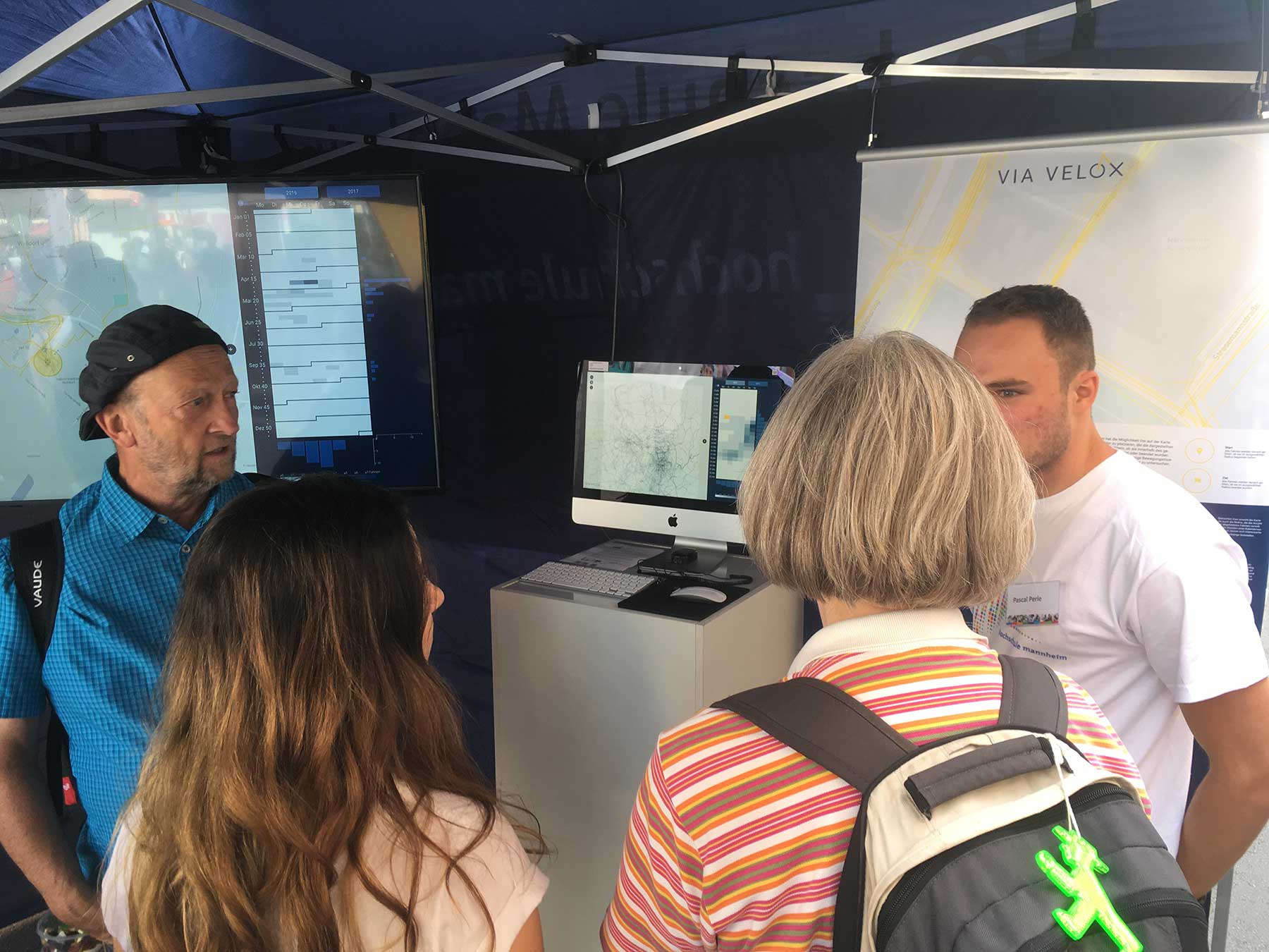


Our goal was to demonstrate Via Velox to interested people, to encourage cyclists to participate in our project by tracking their rides, and generally to get some informal feedback to our visualizations, and discuss bike related themes with the public.
Conclusion
The project was a great opportunity to work on a research-oriented project in a small motivated group. We designed and discussed wireframes, solved various problems on the way, and developed a series of datavis experiments before implementing the final prototype.
First feedback from visitors of our exhibition booth let us to believe our visualization system works as intended. The attractive visualizations and simple but powerful interactions make bicycling data accessible and comprehensible. Overall, we hope Via Velox helps to better understand which routes are used more frequently, and how to improve safety on the way to work, school or university.
Credits
Deniz Kaya
Büsra Keles
Dimitry Nagorny
Pascal Perle
Philip Pregler
Lisa Rudolf
Martin Schröder
Ugur Tunali
Supervision by Prof. Dr. Till Nagel
Via Velox is part of the SAP Next-Gen project “Bedarfsgerechte Radnetzplanung” (“demand-oriented planning of a cycling network”) with GeoNet.MRN as sponsor. Further partners besides the University of Applied Sciences Mannheim are the Database Research Group of the University Heidelberg, the Institute for Enterprise System at the University Mannheim, the GIS station at the Pädagogischen Hochschule Heidelberg and others.
© 2017 Till Nagel and team, University of Applied Science Mannheim
Footnotes
-
Accuracy is calculated by the difference in length compared to the original track. A simplification with a ε of 7*10^-5 results in a compression ratio of 13.5. (Compression values based on 300 test tracks.) ↩
-
Encoded Polylines only use delta positions, and reduce the size by 77.1% or a compression ratio of 4.4. (Compression values based on all available tracks.) ↩
-
Polylines had to be calculated locally as the used version 2.3.3 of PostGIS has a bug calculating encoded polylines when there are more than 155 Points. ↩