Jonas Stadter, Edgar Koop, Luca Büttner, Fernando Azevedo
Modalo
Modalo is a intuitive, simple and powerful visualization tool for multimodal movement analysis. It was designed to support the public traffic management of the “Münchner Verkehrsgesellschaft” (MVG) in Munich. This visual concept is a result of an interdisciplinary data visualization research project by students of the University of Applied Sciences Mannheim in cooperation with “PricewaterhouseCoopers GmbH” and MVG.
Introduction
MVG is doing a preliminary study testing a mobile application which tracks the users’ geographic movement anonymously. They saw potential in the trajectory data and turned to the University of Applied Sciences Mannheim in search of an innovative, supportive and valuable way to visualize this data.
The measured data is special in that it shows entire movements of users regardless of the means of transportation. This allows a MVG traffic planner to analyze actual client behaviour and compare it expected behaviour. Modalo provides the necessary visual aid and powerful functionality to understand the needs of customers which would remain unveiled otherwise.
The Concept
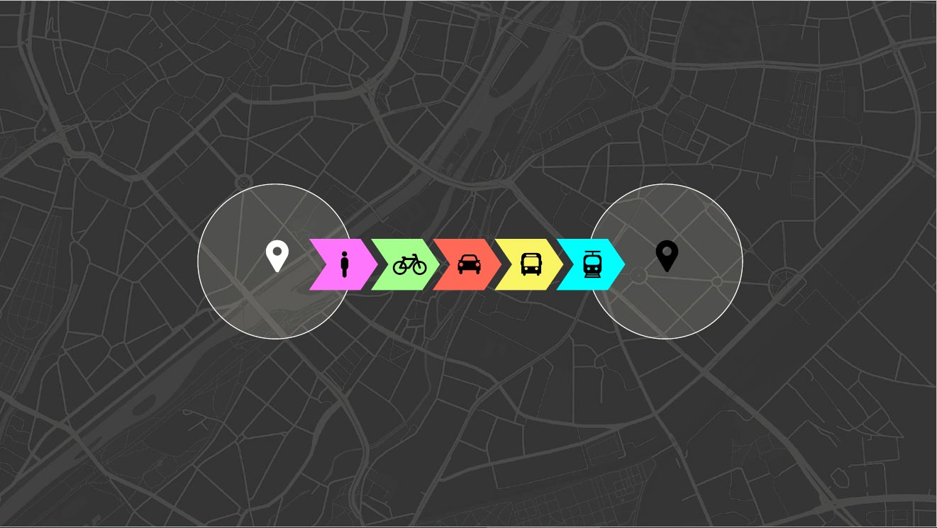
Modalo is essentially a map on which measured movements are projected in form of a line. These movements can be of five different modalities. A modality refers to the means of transportation that was used. The available modalities are on foot, bicycle, car, bus and train. Each modality is represented by a color.
Home Screen

This image shows the initial screen that a user sees after opening the application. The background
consists of a dark map, framing the heart of Munich. The map can be intuitively repositioned with the pointer like other
popular map systems. A user can shift it by dragging it with the pointer and also zoom by scrolling.
The foreground is composed of all interactive features and tools which are addressed more thoroughly below.
Movements are only projected when a starting or ending point is set. This decision has two reasons.
First, a display of all trajectory would be messy, confusing and deflective.
Second, MVG is an experienced company, that already now regular movement patterns. Modalo
is supposed to support an specific, fast and regional analysis.
Usage
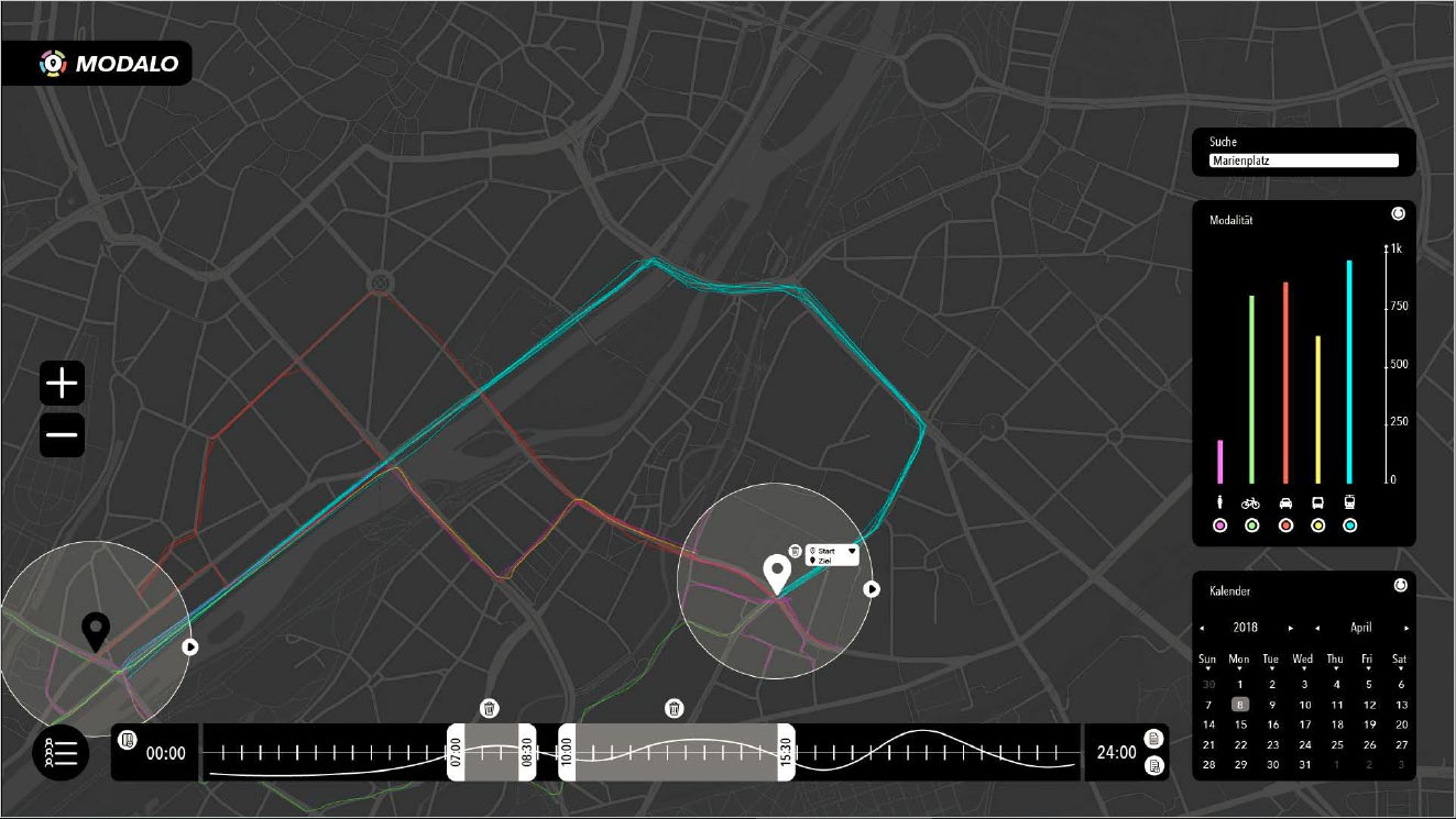
In the above figure, one can see that two markers are set: a start point and an end point.
Movements between the two points are displayed, with the bar chart on the right showing the amount of trips for each modality. In the time slider at the bottom two time periods during one day are selected, which filters the movements shown in the map.
This view can be quite overwhelming without any context. Let’s have a more detailed look at each component, its functionality and use.
Marker
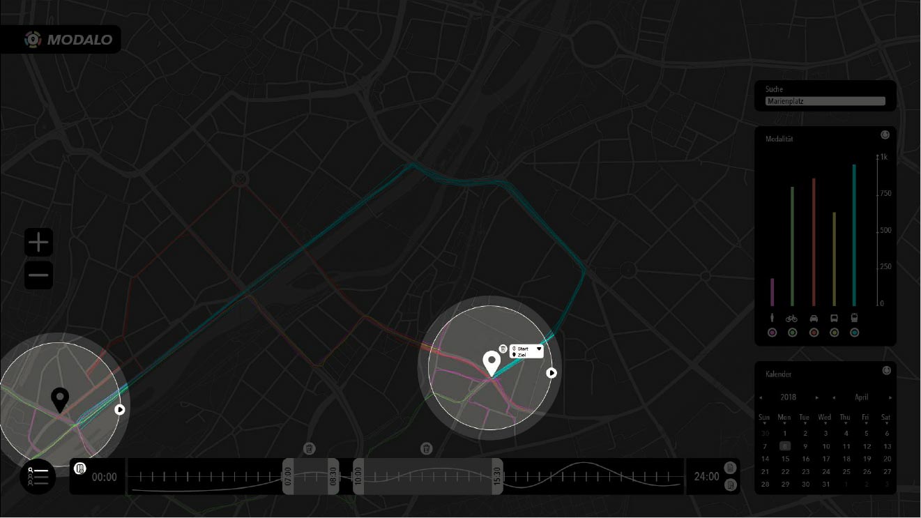
Markers are used to select starting and ending points of movements. They are created and pinned by
clicking on the location of interest on the map. A marker has a default radius and type, which can be specified
while it is selected. A marker can be selected by clicking on it. The radius can be changed by dragging the edge away
from or to the center. The type can be either
a starting point or ending point, a small drop down box on the right side of the center allows a selection of the type.
Marker act as geographical filters, they are triggered as soon as one is set.
A starting point marker shows every movement that starts it the same within the markers radius the same goes for ending
point markers and movements that end within its radius.
It is possible to set multiple markers of each type for a distinct movement analysis.
Temporal Filter
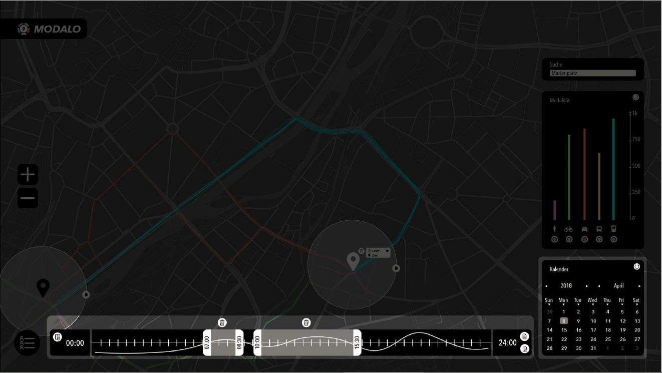
The selected time is used to filter the movements chronically. Only movements that intersect with the selected time are
plotted on the map. A chronic filter essentially consists of time periods during selected days.
Days can be selected in the bottom right corner with the calender, simply by clicking on a day to include it and clicking
on it again to exclude it.
Time periods can be selected on the bottom of the screen in the vertical time line.
It represents a whole day starting at 00:00(left), ending at 24:00(right) and marked with a sampling rate of half an hour.
The white curve in the background represents the overall movement frequency course of all selected days.
Two time periods are selected in the picture above. A time period is represented by two handles, that constitute start and
end points, and a opaque highlighted zone between those handles. Add a time period
by clicking the icon next to the “00:00”, remove on by clicking the trash icon above the time period.
Multiple time periods allow for a analysis of reoccurring patterns in time.
The entire day during usage is selected by default. At least one day has to be selected and the entire day is used
if no time period is selected.
Search Bar
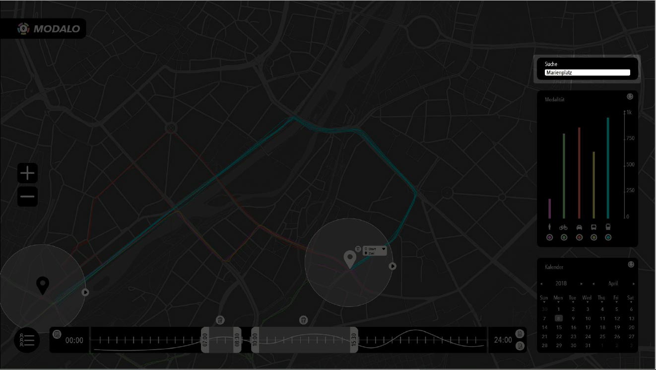
A search bar situates in the top right corner. It can be used to find locations quickly. The map centers around the location if a matching location is found.
Modality Histogram

The modality histogram is on the right side of the screen. It shows the frequency of used modalities in all selected
movements. For example a movement that starts of with the car but ends up using a train, is count as the modality of a car
and a train.
The histogram is fairly intuitive, every modality is represented by a corresponding icon on the x-axis and a frequency
bar on the y-axis with a dynamic scale. The colors used for the bars are also represented as the color of the movement projection.
Under each icon lies a clickable button, one click deselects the color to white and a second click deselects all movements
that consist of that modality. This feature allows for a modality-driven analysis of the movements.
Modality Diagram
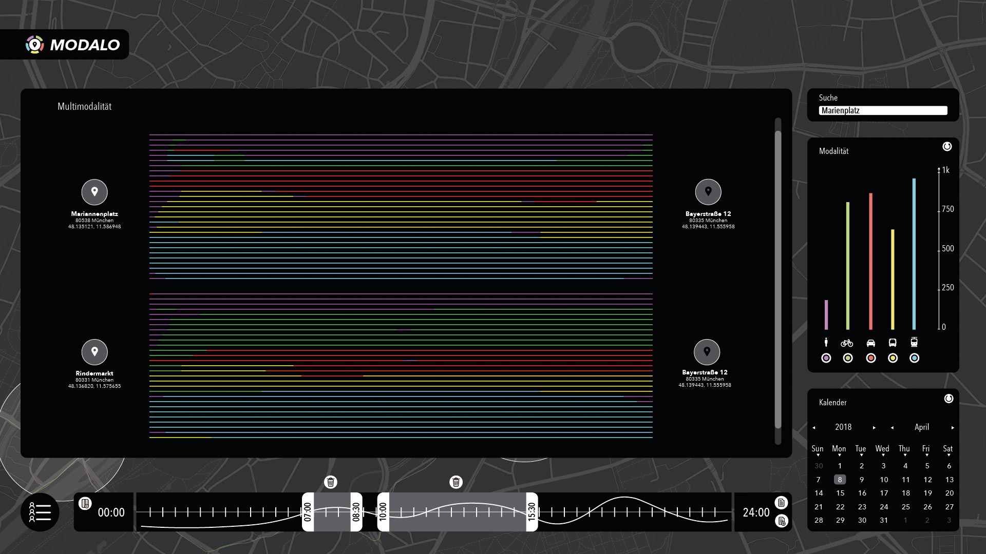
The last feature is the modality diagram. It plots the movements between starting and ending points. The movements are all represented chronically correct in a vertical bar of the same length. Modalities are plotted in the same colors as in the histogram. The length of a modality is plotted in percentage to the entire movement. The movements are ordered by modality percentage in order to facilitate an evaluation. This diagram allows for a quick visual pattern modality analysis.
Project
Requirements
Our partners provided a general description of the data. They also planned to provide us with actual test data over the course of the semester. Their request was an innovative visualization idea for the data.
As already stated we see potential in the data for a visualization tool for public traffic planner. We did not know of an
existing tool that targets a similar audience, this woke our interest, specially since the data holds transport modality information.
Our partners were able to provide us with some general, high-level descriptions of the public traffic planner’s needs and tasks. Yet, we did not have the chance to discuss these with planners in details. Thus, we employed a few assumptions in order to design Modalo.
First, MVG is an experienced company with plenty of knowledge on their customers behaviour. Second, traffic
planner create schedules based on historic customer behavior, and plan ahead for a longer time period. Third, they work together
with the local government to manage traffic.
Thus, we assumed that they do not need a monitoring system but rather one for
historic data investigation. The system should enable a regional behavioral movement querying. It should be
intuitive and visually supportive in order facilitate the usage. Furthermore, Modalo should provide a set of features and
tools that allow for an extensive and comprehensive analysis.
The concept was developed based on these assumptions and requirements.
Brainstorming
We started out by brainstorming visual ideas and creating sketches. The following images show the results of that the brainstorming process.
Map, Modality and Time


The first two sketches show two images on which one can see the map in the background with a modality selection frame on right side. We figured that a map is a recognizable and intuitive tool, specially for a traffic planner. Our first drafts also included a modality selection box, that a allows to blend certain modalities in and out. The first picture does also contain a time filter in the bottom of the screen in order to filter the movements.
Statistic Summary
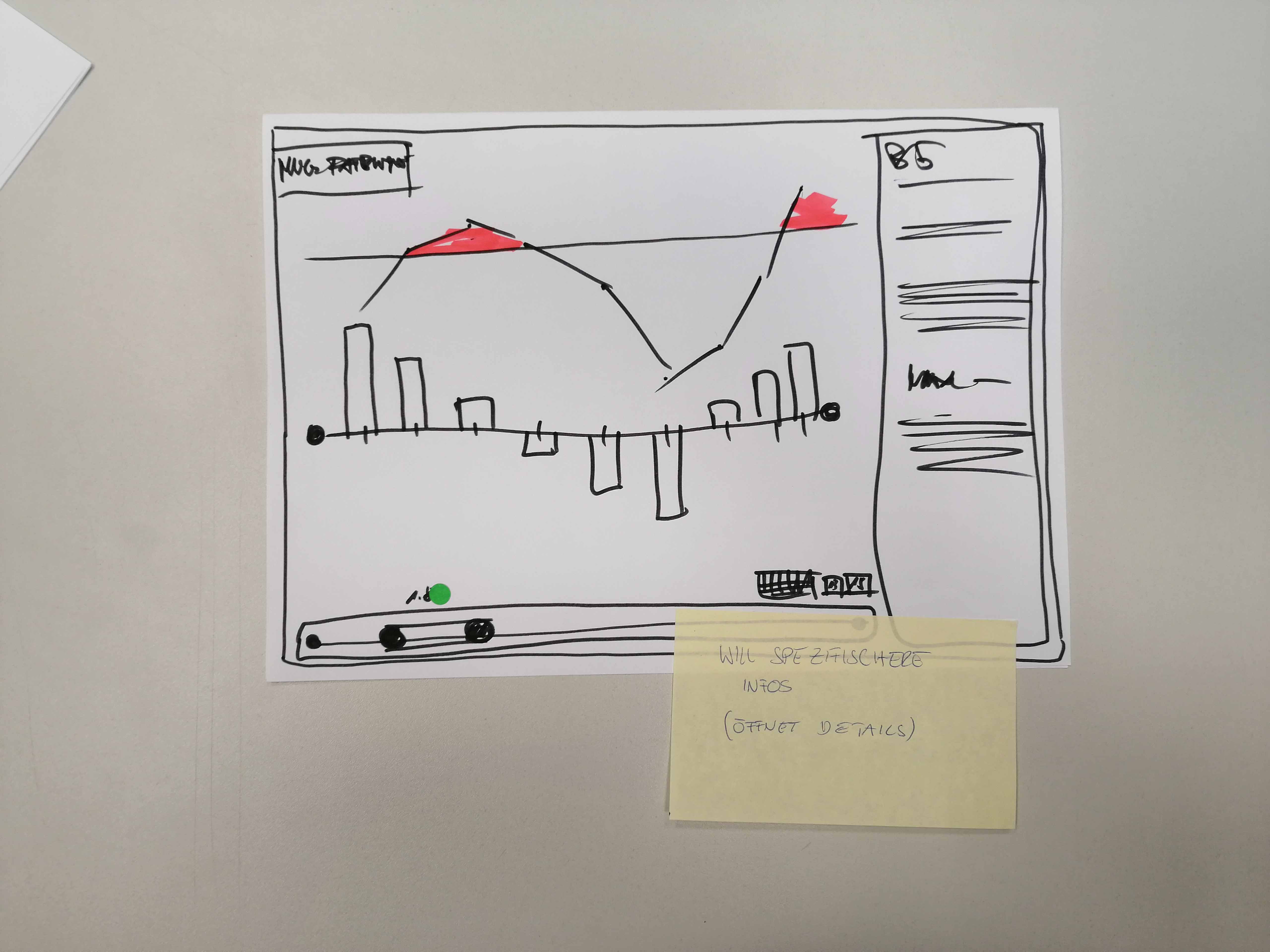
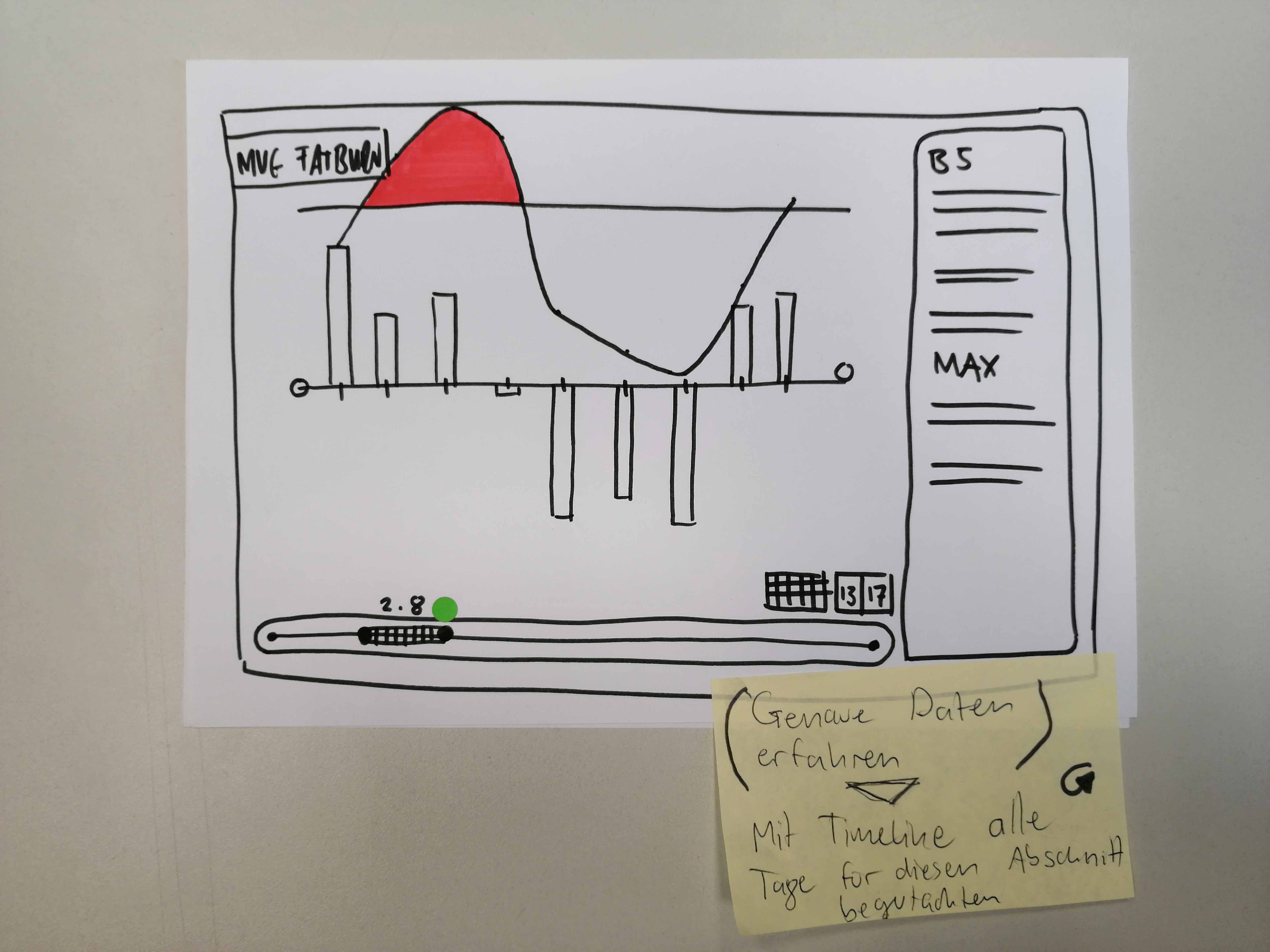
Next to the map we also wanted to provide plots and diagrams that bear quick and extensive information for a user. In the two plots we can see sketches for a bar plot that shows the amount of movements during a certain time. The time line on the bottom got an additional calender option above it on the right side. The frame on the right was initially thought of a method selection box. It was supposed to allow a statistical method selection. We ended up dropping this idea because we did not know enough about the necessities of a planner and we thought that it was rather complex to grasp. We ended up using the calender and timeline coupled with a the course of the amount of movements in its background.
Prototyping
Our partners were unable to provide us with actual test data in time with our strict semester schedule. This was a bit unfortunate since it left some questions unresolved. As we were unable to implement a fully working prototype, we put our attention on the concept and worked out possible implementation guides for Modalo.
Data
First of all the data should be explored. In what format is it available? Popular formats are CSV or GeoJSON. How will
they enter the Modalo system? These are relevant questions in order to select the software packages to work with.
Most GPS data needs to be preprocessed in a way or the other. Possible problem could be the data accuracy or faultiness.
Its overall quality has to be analysed. Possible preprocessing steps are noise filtering and map matching. A key topic
in our use case is the modality. Extracting the modalities of the trajectory data is a definite pre processing step.
Then there is the issue of the movement extraction. How do we distinguish relevant movements from irrelevant ones,
clients could leave their gps tracking on for indefinite time. All these questions and maybe more have to be answered to
a certain extend, before further implementation can be coordinated.
Implementation
Modalo can be implemented by in several ways and programming environments. We intended for it to be a desktop application
since most analysis are of complex nature and a mobile alternative would not bring any advantages. Popular frameworks are
leaflet.js and d3.js for javascript. Both are open-source libraries and have
a big community behind them with extensive tutorials and examples.
We tried to get multi modal trajectory data but we did not find any available data. Instead we generated some trajectory
data for a test implementation.
We tested the a simple map implementation with and trajectory projection with leaflet in form of a webapp. A advantage of
javascript frameworks is that they can be implemented as web applications and also as native application with small effort.
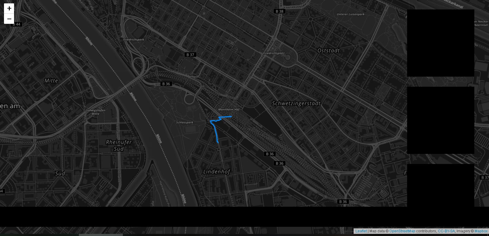
This picture show a simple leaflet map implementation and a self generated trajectory projection. The map is centered
around Mannheim and the trajectory does not contain any information on its modality. The black boxes on the right side
and the bottom are place holders for the actual tools, that were not implemented.
Leaflet uses layers to generate a map. The initiation layer is generated with one line of code:
const mymap = L.map('map').setView([49.487, 8.466], 13); # setView fixes maps around coordinatesL refers to the leaflet package, all functionality can be accessed through it.
The tile layer contains the actual map:
L.tileLayer('https://api.tiles.mapbox.com/v4/{id}/{z}/{x}/{y}.png?access_token={accessToken}', {
attribution: 'Map data © <a href="https://www.openstreetmap.org/">OpenStreetMap</a> contributors, <a href="https://creativecommons.org/licenses/by-sa/2.0/">CC-BY-SA</a>, Imagery © <a href="https://www.mapbox.com/">Mapbox</a>',
maxZoom: 18,
id: 'mapbox.dark',
accessToken: 'pk.eyJ1IjoiZ2F2dmVsIiwiYSI6ImNqcDl6YzU1aTIzcGUzcHB4ZnFibDgzam4ifQ._r57uOjZlkreGfKFZNiDUg'
}).addTo(mymap);The map in this example is provided by mapbox, a powerful location platform, that provides
a tools for a custom map creation.
const routesLayer = L.geoJSON().addTo(mymap);

$.getJSON("/../data/301118.json", function (data) {
    routesLayer.addData(data);
});
The routeslayer contains the trajectories which are projected onto the map.
This test implementation demonstrates the foundation for an actual implementation. Missing elements are obviously the
interactive features. The markers can also be implemented with leafletjs
and the rest (timeline, histogram, calender etc.) can be implemented with d3.js.
Conclusion
We managed to create a concept that fulfills our own requirements. Modalo is an aesthetic, powerful and intuitive visualization
tool that got good feedback from a MVG representative. However, we see a collaboration with actual public traffic planners
and an extensive requirements analysis as beneficial to optimize the concept. Furthermore, analyzing the actual collected data
would be of great importance for a effective implementation.
As a first step we would compare our requirements to theirs, if needed adapt the features to their need and then discuss
open issues. The movement aggregation is a topic that we are aware of and that needs further integration.
The storing and querying of temporal filter templates is another feature that could be integrated. As well as detailed client
movement profiles and the possibility to exclude certain areas in an analysis. All of this is up for future work.
Team
Thank you for your interest in our project.
