Mariya Bolotnikova, Xiaoyi Dong, Jana Puffay, Timo Sona, Alexander Stein
desite
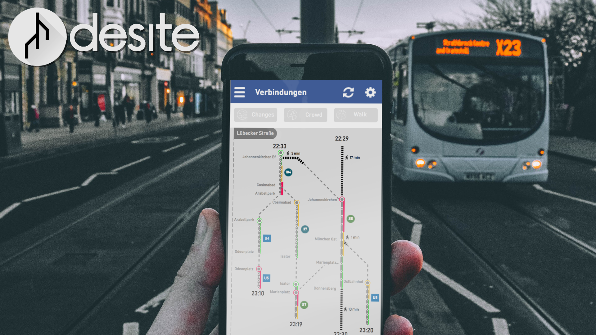
We developed the project desite to answer one question: How can we help passengers to reach their destination according to their needs?
The Challenge
According to research, travel preferences vary among urban commuters; some want to take the fastest route, some prefer to have the least walking or minimized interchanges, yet others prefer minimal waiting outdoors. Thus our challenge is to visualize and present transportation possibilities on smartphones according to the passenger’s needs.
The name desite was derived from decide and on site. It is meant to highlight the unique feature of our product: To give passengers all information they need for decision making in-situ, that is in the moment and at the place they are.
At first, we have looked at existing transit applications and digital services such as MVG, Deutsche Bahn and Google and analyzed both their positive and negative features.

|
|

|
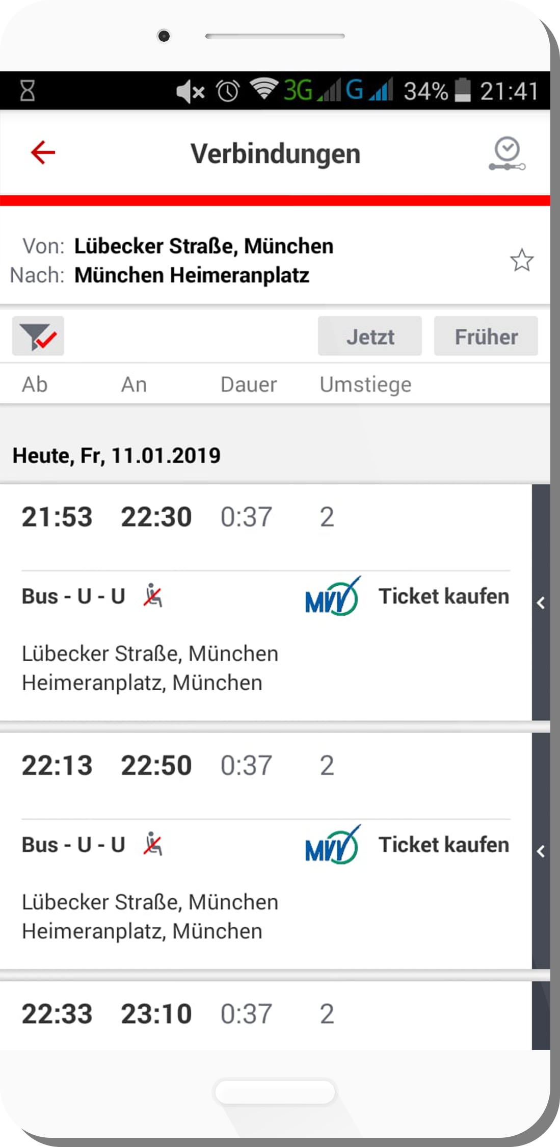
When looking at already existing apps we noticed some positive and some negative aspects. On the one hand, it doesn’t seem possible to look at several offers in detail at the same time. Moreover, nowhere is it apparent that you can get on the same subway from 2 different buses, for example. With the Deutsche Bahn App there is also for example only a list view and no kind of visualization. But there were also positive things. The lines make it possible to quickly capture and understand the route being displayed. Also how the delay and waiting time was displayed seemed very conclusive to us. Now, from this point of view, we wanted to create an extension that wouldn’t seem too foreign to the user, but would still provide much more information.
Visualization
Then we experimented ideas with heat maps and swim lanes; we decided to continue with a latter, for it can display multiple groups of data. For the outcome, we would like to offer our users with more flexibilities and options to meet different needs. That means they could customize the visual data display by focusing on each preference such as passenger load, walking time and interchanges.
We rejected the idea with the heatmap quite quickly, because this way of representation quickly becomes too confusing. Furthermore, the idea with the swim lanes didn’t seem innovative enough to us, but it was the right direction from the two approaches.
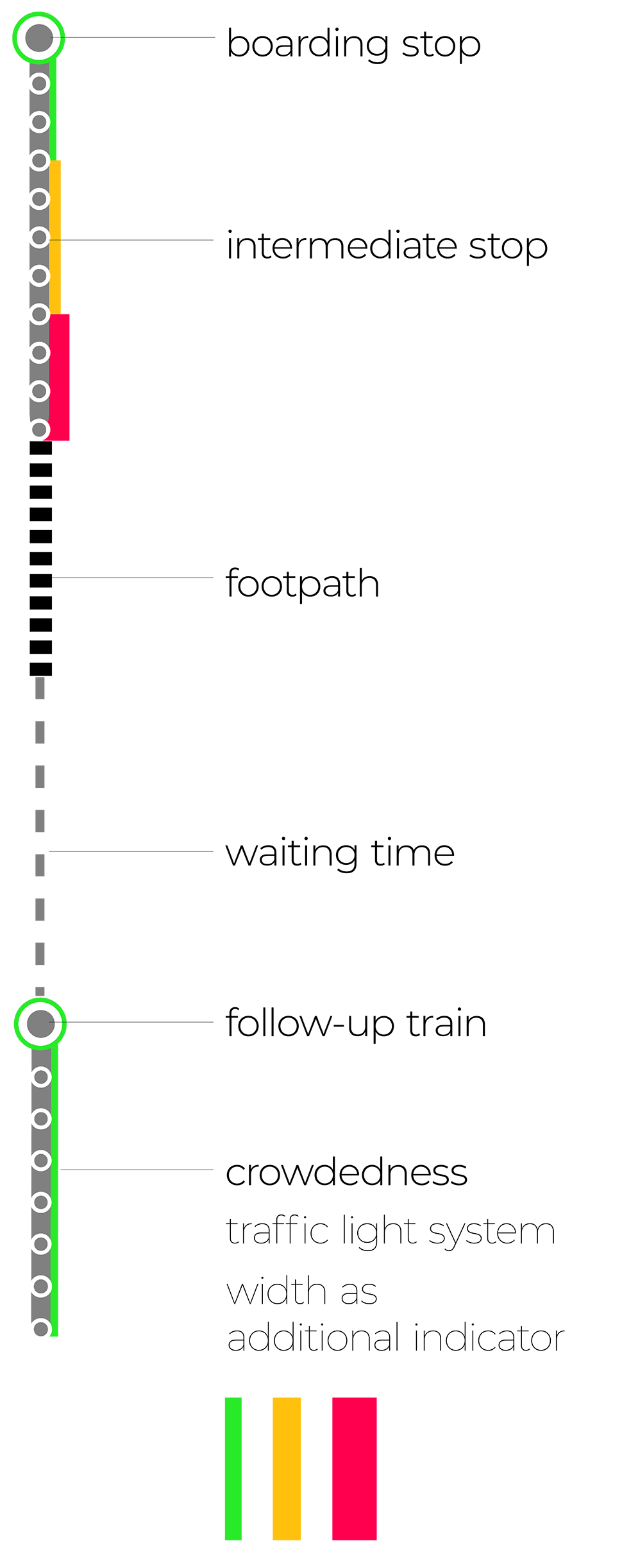
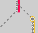
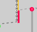
With a simple traffic light system and a mild thickening of the line, we quickly show the viewer how full the vehicles of the lane he wants to take are, and whether he can get a seat in it. We chose this double encoding, because this color scheme is widely known and can be integrated into the app in a well recognizable way. Other attempts to visualize fill levels were far too confusing and complicated. The stops where you get on are bigger than the other stops and are displayed in a circle. The circles stand out from the lines representing the vessels, but do not attract too much attention. The waiting time and the running time are shown with differently coloured and dotted lines so that they can be easily distinguished from each other. The lines are dotted so that you can see at first glance that there is no driving, but that there is a kind of interruption of the journey.

The example route shows the possible connections from Munich main station to Munich Freiheit from 12:30. The first possible connection is the U4 at 12:31 with a change to the U3 at 12:37 at Odeonplatz. The next possible connection starts at 12:32 with the U2. A change to the U6 takes place at Sendinger Tor. The third possibility is in the U5 at 12:34. Here you get off at Odeonplatz and change to the U6. This is the same U6 as in the second route. Desite makes it possible to display links and overlaps, which makes it possible to display a large number of routes in a small space
Prototype
One of the important tasks in the design process is to figure out our unique selling point, so that our product could contain more values for its target audience. Firstly, passengers can view all information they need for traveling on the screens of their phones, including time and locations of departures and arrivals, delayed routes, passenger load and walking time.
| Secondly, The product will show live information of each route. It will inform and suggest an alternative solution when delay occurs to a route. There will be less frustration and worries due to the delay. |
Thirdly, it is very flexible and efficient for all the passengers to choose the best route by adjusting data visualization according to the top priority of their preferences. To be more specific, passengers can choose to display either the crowdedness, walking time or interchanges on each route. Then they could compare all the available routes with each preference. Last but not least, our project can apply to any other traveling app as a Plug-in or Add-on. Thus, it will cost less and be very compatible with older systems.
Realization
To create the characteristic decision tree of desite, we used an four step approach, which will be explained in the upcoming paragraphs.

|
INPUT INFORMATION Before we start looking at the the methods used to create the visualized output, we first need to clarify the required input information. These information should consists of a set of multiple routes, which describe possible ways to get from location A to location B (Fig 10). Each route is composed of a list of stations (or geo locations) which are connected through segments and footpaths. |
|
STEP 1 In our first step to create the decision tree, we created a new data model by leaving out the footpaths. By leaving out those information, we reduce the complexity of the model and make it easier to work with. The information about the footpaths for each route will be saved for usage at a later step of the process. |
|
STEP 2
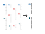
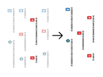
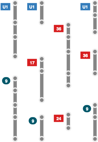
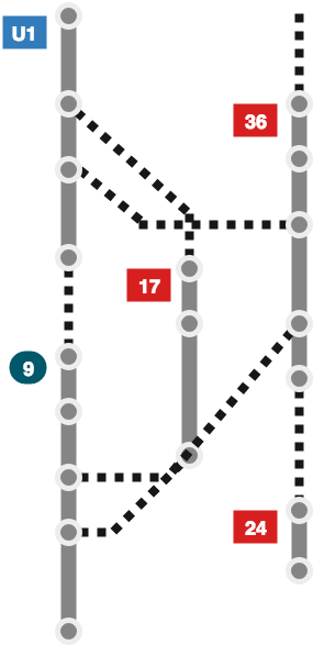
| The goal of the second step is to remove all redundant information. We approached this goal by creating an empty model and adding new information from each route individually to this model. In this process we can filter out redundant information before adding them to the new model. This gallery shows the step by step approach using the sample data of figure 6. |
|
STEP 3 When the new, non-redundant model is created, the left-out footpaths can be added again. In many cases, the visualisation will loose clarity when displayed with these information. The reason for this are overlaps in between different route options. |
|
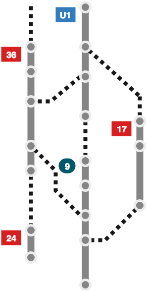
STEP 4 In the fourth and last step we want to dispose those overlaps by resorting the routes. We change the order of the routes over and over, until a combination without overlaps has been found or all possible combinations have been tried. If all combination options have overlapping footways, the option with the least overlaps will be chosen for the final visualization. |
|
We created a basic webapplication using the JavaScript frameworks VueJS and D3.js and used the previously explained algorithm to create the desite data model. For this, we used manually created ‘mock’ data and live data provided by the public transport company (MVG).

|
|
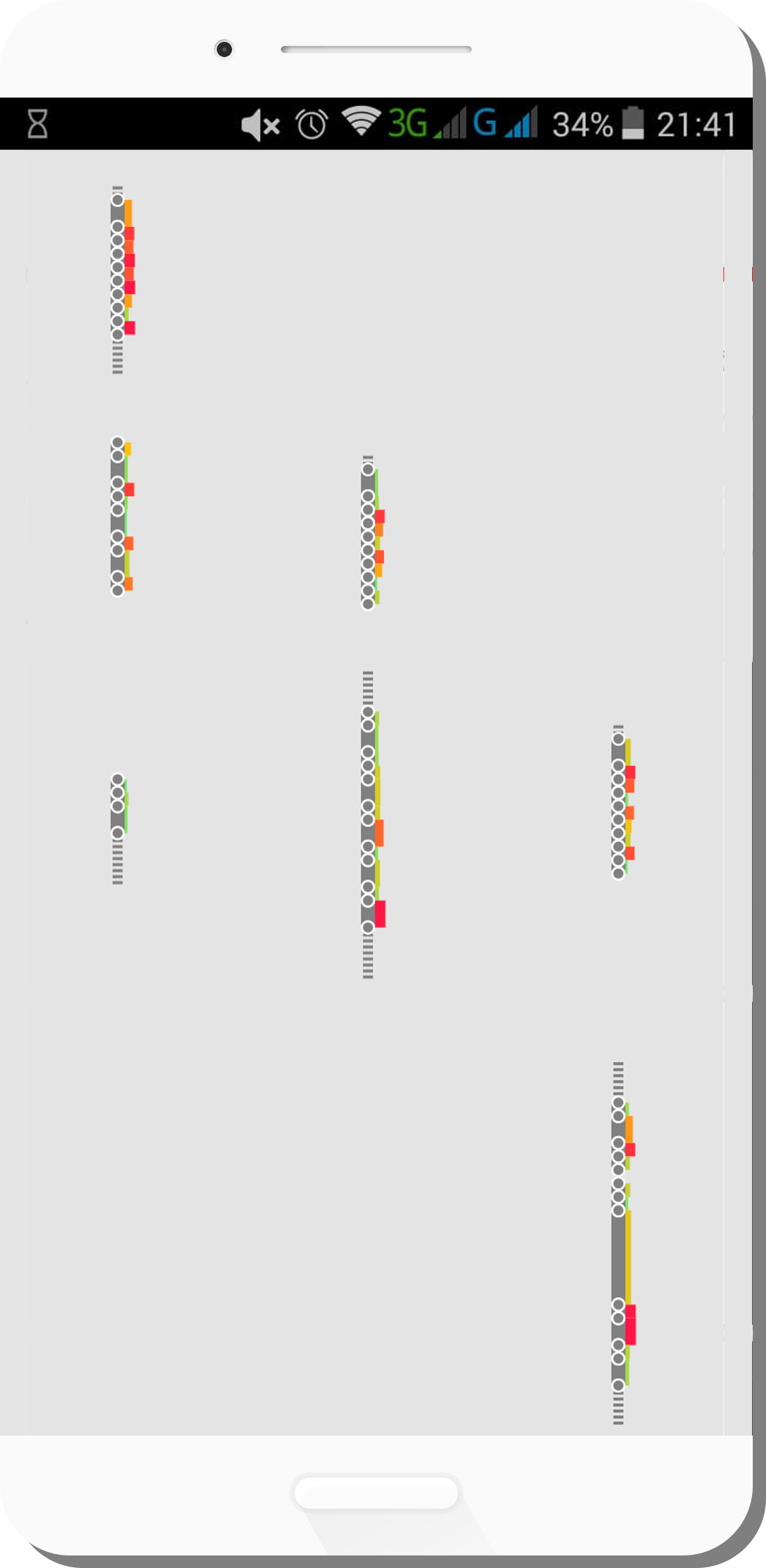
When feeding the manually created data to the program, the created output model was working as expected (Fig. 18). When using the data provided by the public transport company, the created model was missing relevant information (Fig. 19). One of the missing information, were the alternative route options. The public interface was providing only one route option for different times of the day. The other missing information in the second model are the footpaths. This issue was caused by differences in the naming of the provided data. All issues can be resolved by using the internally available data from the public transport company.
The creation of the desite desicion-tree is not only possible, but also simple. The biggest efford is caused by converting the existing data into the required shape.
Conclusion
First of all we have to look at what is obvious. You are able to view all the information you need for your whole travel on a screen at the size of your habd. No other windows, not even a single click. Everything you need is on and in your hand.
Secondly a user can choose by self how the trip should be. Within using variables like filling of the vehicle to a shorter travelling ‘till a trip with less or even no changes.
And last but not least: our app can cause less costs in workload and finances by just being implemented like a plugin to the app that is already there.
Future Prospects
For our future outcome we see a lot of potentials. Wearable devices are getting more popular as well as notifications about changes on routes, alternative options or even just a reminder for getting off. Smart clothing advances interactions.

The Tom-Tom System would be a simple but very practical addition to our idea. Simple and short: Person X is on the way with line 1 and there is a fault or something similar. Now the smartphone of person X registers: we are standing. It now sends this information on so that other smartphones can access it. So person Y, who was about to take line 1, gets the message: Attention, something has happened, better take another route.

AR on Smartphones is another option. You donít know where exactly you are at or where you can go from your location? Just hold up your camera to get a HUD and scan a bypassing bus to see where it is driving and how much it will cost. Your device will be there to support you whenever you need, and all your journeys will be pleasant. It is after all easier, more convenient and more potential than ever before.

